Watercolour Art Therapy | Color Mixing for Emotional Healing
How therapeutic watercolour color mixing evokes healing emotions. Learn mindfulness watercolour techniques for wellness spaces and emotional landscape painting.
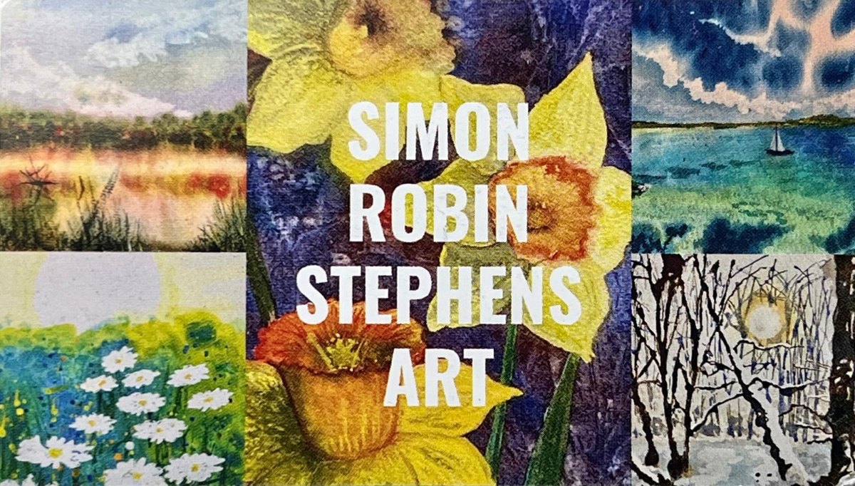
Simon Robin Stephens
ADHD Artist & Watercolour Specialist
Color is the emotional language of painting. While composition draws the eye and technique demonstrates skill, color speaks directly to the heart. In landscape painting, understanding how to mix and apply colors emotionally can transform a simple scene into a powerful, evocative work of art.
The Psychology of Color Temperature
Warm colors—reds, oranges, and yellows—naturally advance toward the viewer and create feelings of energy, comfort, and intimacy. Cool colors—blues, greens, and purples—recede into the distance and evoke calm, melancholy, or mystery.
But here's where it gets interesting: context changes everything. A warm orange can feel comforting in a sunset scene but aggressive in a storm painting. A cool blue might be peaceful in a morning mist but lonely in a winter landscape.
The Power of Limited Palettes
Some of my most emotionally successful paintings use surprisingly limited color palettes. A landscape painted with just ultramarine blue, burnt sienna, and raw umber can convey more emotion than one using every color on the palette.
"Limited palettes force harmony. When you mix most of your colors from just two or three base pigments, everything in the painting relates to everything else."
Seasonal Emotions and Color Choices
Each season carries its own emotional palette. Spring paintings often benefit from fresh, clean colors—sap green mixed with lemon yellow, or ultramarine with just a touch of violet. Summer calls for rich, saturated hues that speak of abundance and warmth.
Autumn is perhaps the most emotionally complex season to paint. The warm oranges and reds speak of beauty and harvest, while the underlying browns and grays whisper of endings and melancholy. Learning to balance these contradictory emotions in color is one of the great challenges of landscape painting.
Trust Your Emotional Response
The most important advice I can give about emotional color mixing is to trust your gut response to a scene. What does this landscape make you feel? Joy? Melancholy? Peace? Energy? Then let that emotion guide your color choices, even if it means departing from literal representation.
Remember, you're not just copying what you see—you're translating how it makes you feel into a language of color that others can understand and share.